[Case 04]
1.42 → 6.54 ROAS
Digital Marketing / Fashion

Turning Performance Data Into a Visual Story
Visualizing Paid Social Growth for Raw & Rebellious
[Project Overview]
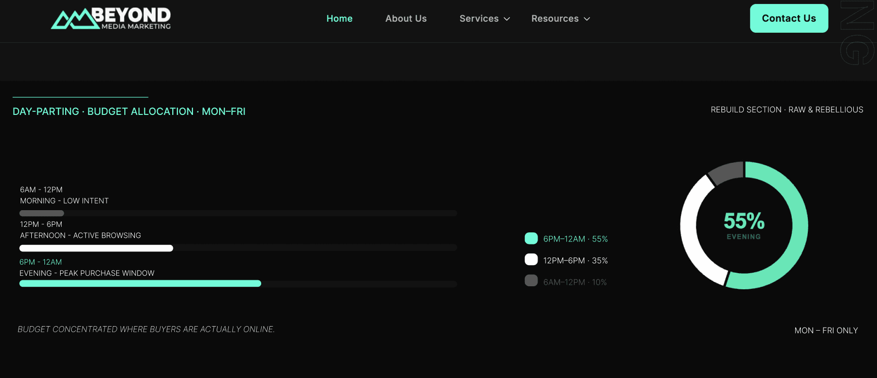
Transformed a performance driven case study into a bold visual experience for Beyond Media Marketing, turning campaign data into clear, engaging website graphics that communicate results at a glance.
[Problem Statement]
The challenge was to translate complex performance data into a clear and compelling visual narrative. Metrics such as ROAS, revenue, CPA, ad spend, and budget allocation needed to be easy to understand while maintaining a bold, cohesive visual identity.

[Industry]
Digital Marketing / Fashion
[My Role]
Visual & Web Designer
[Platforms]
Web & Social
[Timeline]
March 2026
[Persona]

Alex Morgan
E-commerce Marketing Manager
I need to see real results quickly. Show me what changed, what improved, and why it matters to my business.
Age: 35
Location: Texas
Tech Proficiency: High
Gender: Male
[Goal]
Quickly understand the agency’s performance impact.
See measurable results backed by clear data.
Determine whether BMM is the right partner to scale the brand.
[Frustrations]
Case studies overloaded with text and marketing jargon.
Performance metrics presented without clear context.
Agency claims that aren’t supported by measurable results.
[Process]
[01] User Research
Reviewed the campaign results and identified the strongest metrics and messages to highlight.
Organized the supplied data into a clear hierarchy to make the performance story easy to scan.
Defined the key visual moments: hero, before & after, performance impact, and day-parting.
[02] Insights
Developed a bold, performance-led direction aligned with Beyond Media Marketing’s existing identity.
Mobile users struggled with small buttons and unresponsive layouts.
Trust the platform with her payment and personal information.
[03 Design Solution]
Simplified the checkout process into three steps: Cart Summary, Payment.
Used strong typography, contrast, and color to give key metrics immediate visual impact.
Created a consistent visual language across the entire case study.
[04] Testing & Iteration
Turned campaign metrics into clear visual callouts that communicate performance at a glance.
Designed a before-and-after comparison to make improvements in ROAS, revenue, CPA, and ad spend easy to understand.
Visualized day-parting and budget allocation through simple charts and supporting data.
[Outcome]
Transformed complex campaign data into a clear visual story.
Created a cohesive system for communicating performance across multiple formats.
Made key results easier to scan, compare, and understand at a glance.
[Key Learnings]
Hierarchy makes data powerful
Prioritizing the strongest metrics helped communicate the campaign story without overwhelming the viewer.
Context gives numbers meaning
Before-and-after comparisons made performance improvements easier to understand than isolated statistics.
Consistency builds clarity
A unified visual system helped different charts, metrics, and content feel like one cohesive story.